Arabic web design that is not a translation
Most UAE websites that claim to be bilingual are an English site with Arabic words poured into it. The layout still reads left to right, the typeface was drawn for Latin letters, and no search engine is told the Arabic page exists. This page explains what a real Arabic build changes, and what it is worth in a market where almost nobody does it.
What 19 UAE agency sites actually declare
I audited nineteen web design and SEO agency sites serving Dubai and Abu Dhabi, reading the raw HTML rather than the marketing copy. Sixteen of them declare no Arabic alternate and no hreflang tags at all. Several show an Arabic flag or an AR toggle in the header that leads to the same English page, or to a page that has been machine translated with the layout untouched.
Three had something resembling a real Arabic version. Of those, one had reciprocal hreflang implemented correctly. That is one site in nineteen doing the basic technical work that tells a search engine which language belongs to which visitor.
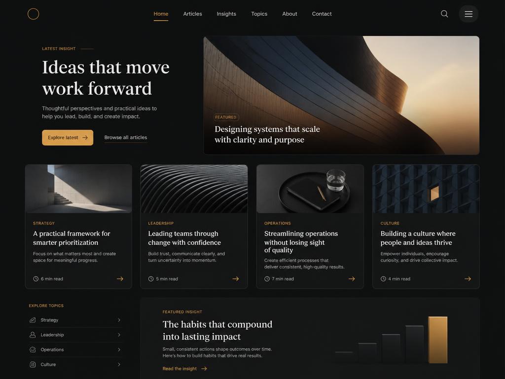
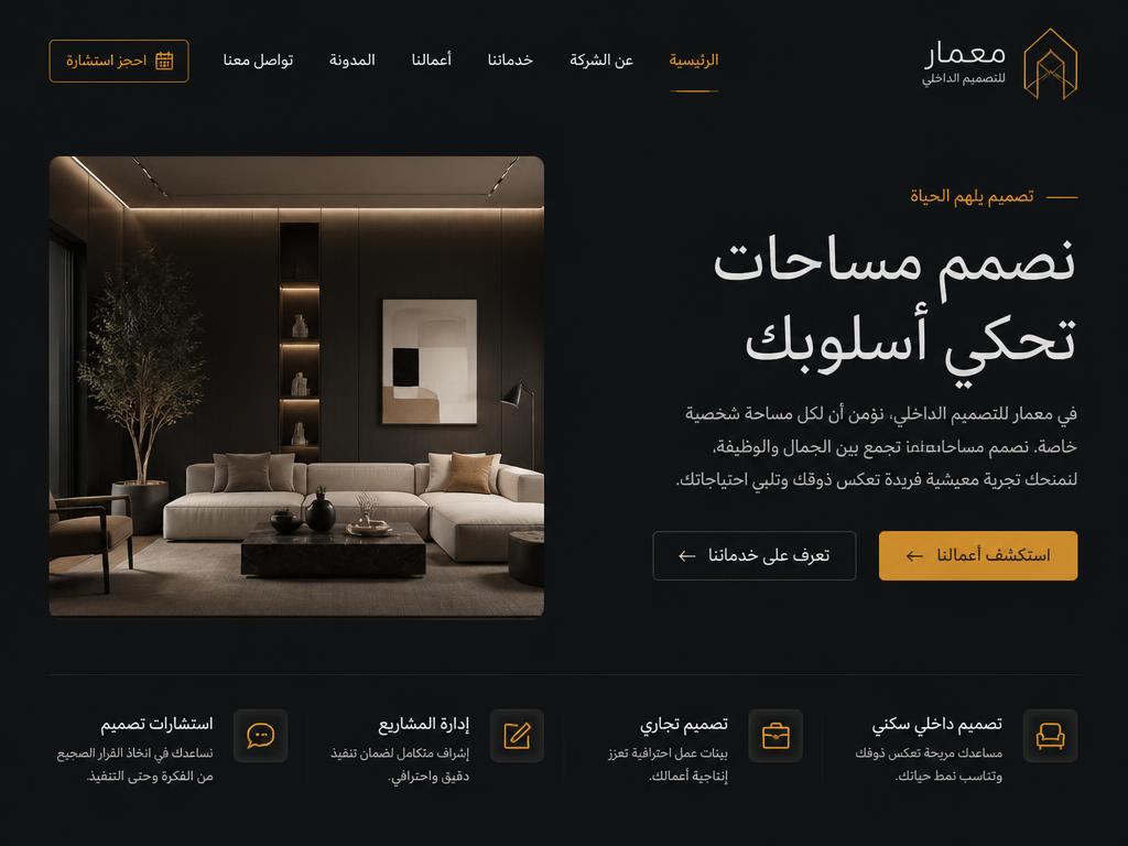
RTL is a layout inversion, not a text direction
Setting dir="rtl" on the html element flips the text. It does not flip the design. Padding that was added on the left stays on the left, the card that was meant to lead the eye now trails it, and the icon that pointed forward now points back into the page the reader has already passed.
A correct build uses CSS logical properties throughout. Instead of padding-left and margin-right you write padding-inline-start and margin-inline-end, and the browser resolves them against the reading direction. The grid flows from the start edge, borders sit on the correct side, and a component added six months later inherits the behaviour instead of needing another right to left patch.
Arabic typography needs its own size and leading
Arabic and Latin scripts do not share metrics. Arabic letterforms connect, carry marks above and below the baseline, and have a much smaller effective x-height relative to their point size. Set Arabic at the same size as English and it reads smaller and denser, even though it is technically the same number.
The working rule is Arabic body text set ten to fifteen percent larger than the English equivalent, with noticeably more line height. Tight leading that looks crisp in a Latin paragraph collides with the ascenders and dots in Arabic and turns a paragraph into a texture.
Western numerals in Gulf business context
Arabic script has two numeral systems in use. Eastern Arabic numerals are standard in parts of the Levant and in Egypt, but across the Gulf, business writing overwhelmingly uses Western numerals: on invoices, on price lists, on phone numbers, on licence plates and on bank statements.
So prices, phone numbers, dates and quantities stay in Western digits on an Arabic page for a UAE or Saudi audience. Switching them to Eastern numerals reads as a decision made by someone who localised from a style guide rather than from the market.
hreflang, x-default and why most sites get it wrong
hreflang is the tag that tells a search engine which language version of a page to serve to which user. It has three requirements and most implementations break at least one of them.
First, the tags must be reciprocal. The English page points at the Arabic page and the Arabic page points back at the English one. A one directional tag is ignored, which is why so many sites that technically have the tag get no benefit from it.
Directional icons are mirrored, logos are not
Anything that implies forward motion flips in an Arabic layout: arrows, chevrons, back buttons, progress bars, carousel controls, sliders and the caret on a dropdown. In a right to left reading order, forward means left, so an arrow that still points right sends the reader back through content they have already passed.
Logos, brand marks, clock faces, product photography, charts with a time axis and any graphic containing Latin text stay exactly as they are. Mirroring them does not read as localisation, it reads as an accident, and a flipped logo is the fastest way to tell a Gulf buyer that nobody senior looked at the Arabic version before it went live.
See this page in Arabic
The argument is proved by switching language, not by describing it. This exact page exists in Arabic with the layout inverted, its own typeface and type scale, and reciprocal hreflang between the two versions.